IQOS Subscription Website
- Website design
- Aug 31, 2021
- 2 min read
Updated: Feb 17
Timeline: 2021.06-2021.08
Client: Philip Morris International
Role: Design strategy, UI/UX design, Visual design
Brief
The IQOS subscription program is a crucial part of the IQOS service, offering an attractive device subscription service for customers through installment payments and comprehensive after-sales service. This helps to alleviate customers' burdens, address concerns about device malfunctions, and expand business opportunities. Accompanying the release of the new generation IQOS device and new brand guidelines, we have entirely revised the UI/UX design of the IQOS subscription website. The purpose of this is to provide a consistent customer experience across the entire IQOS service and to promote the sales of the new generation IQOS devices.
Research

Subscriber Attributes
Based on the characteristics of our subscribers, we're able to construct a persona representing our target user. Concurrently, this allows us to begin exploring consumer insights and identifying potential opportunities.

Target User Persona

Targeted Needs Along the Consumer Journey
Affordability is one of the obvious pain points a subscription program can address while offering flexibility to customers' purchase options (PAYG or Subscribe). IQOS Device Subscription also conveys peace of mind or a trouble-free experience, including extra subscriber benefits (value for money).

Brand Guideline
Re-design

Japan Market Localized Design System
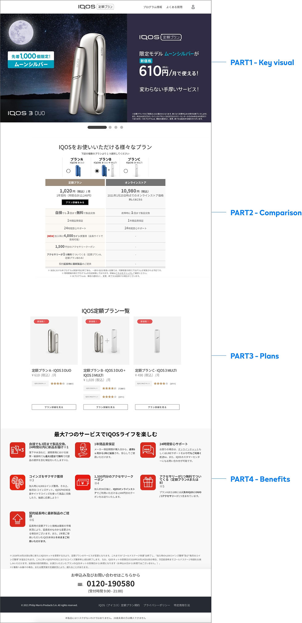
Legacy Landing Page

Legacy Plan Detail Page

Key Visual Re-design

Comparison Block Re-design

Subscription Plans Block Re-design

Benefits Block Re-design
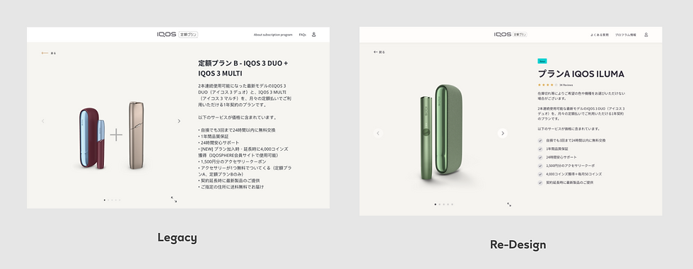
Plan Detail Page Re-design

Product chosen block Re-design
Desktop High-fidelity Prototype
Mobile High-fidelity Prototype
Result
Two months after the website launch, we analyzed the Scroll Reach Map and Click Heatmap to understand user interactions with the site. Here are the key findings.

Scroll Reach and Click Heatmap of the Landing Page
The Call to Action (CTA) elements are receiving good interaction, however, the colored dots seem to be causing some confusion.
Further down the page, the CTAs within the comparison section are also drawing substantial engagement.
According to the Scroll Reach Heatmaps, about 60% of visitors scroll beyond the initial view of the page.
The Scroll Reach data indicates that 60% of page visitors view content below the Subscription Plan CTA, while the comparison section is viewed by 50% or fewer visitors.

Scroll Reach and Click Heatmap of Plan Detail Page
Click heatmaps reveal that the primary areas of user engagement on the page are the color palette of the product and the carousel image selector.
According to the Scroll Reach heatmaps, it is observed that all visitors view the product listing at the top of the page, which aligns with the expected behavior.
The menu navigation at the header of the page experiences minimal user interaction.
Comments